I didn’t choose blue and silver deliberately at first.
They simply kept appearing.
When laying out materials, when selecting threads or charms, my hand often reached for cool blues and soft silvers without much thought. Over time, I began to notice the pattern — and the feeling behind it.
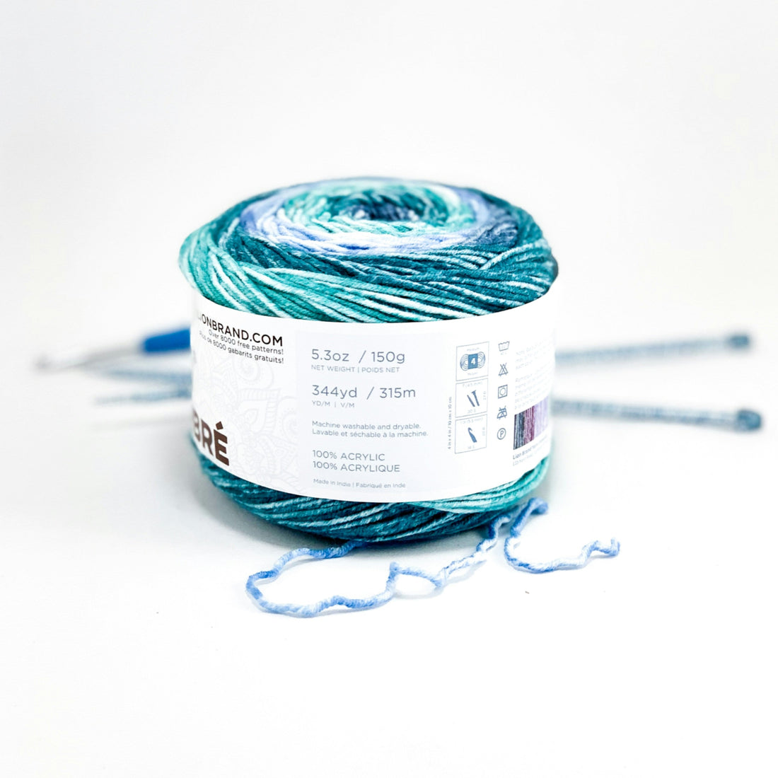
Blue carries space.
It doesn’t rush forward or demand attention. It allows things to breathe. Blue feels like distance, but not loneliness — more like standing near a window, watching the world move without needing to step into it.
Silver feels similar, but different.
It reflects rather than absorbs. It’s quiet, neutral, and protective. Unlike gold, which feels warm and declarative, silver feels observational — present without asserting itself.
Together, blue and silver create a calm balance.
They don’t overwhelm. They don’t insist on meaning. They simply exist, leaving room for whatever emotion happens to be there.
When these colors appear in my work, they’re not meant to symbolize anything specific. They’re there because they feel safe. Clear. Honest.
Perhaps that’s why I keep returning to them — not because I want to say something loud, but because I want to leave space.


